Once a month, we provide our clients with a fact sheet on their investment strategy. It offers deeper insights into performance and the relationship between return and risk.
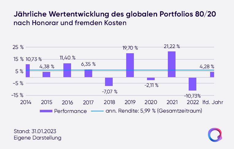
Plus 4.28 percent in the "Global Portfolio 80/20," plus 3.57 percent in the "Sustainable Portfolio 50/50." The stock markets got off to a good start to the new year - and so did quirion's portfolios, as their performance through the end of January shows. That's gratifying. But it remains just a snapshot in time.
To give you a deeper insight into your investment strategy at quirion, we create a fact sheet with the most relevant information once a month. Beyond performance details, you'll find a wealth of additional data in it, such as on risk metrics and on costs. The report is put together by our colleague Selda Kazankaya, Head of Portfolio Controlling at Quirin Privatbank and at quirion. A trained mathematician with a master's degree in "Financial Services and Risk Management," she keeps a close eye on the portfolios and strategies.
Performance across multiple time frames
What certainly draws the most attention appears right at the top: "We first show performance after costs over various periods," Kazankaya explains. The charts make it possible to see at a glance how the investment strategy fared in individual years. But also how steadily the strategy has been able to build wealth since January 2014. "One meaningful figure for this, for example, is the annualized return over the entire period."
More risk, higher return potential
Return is one side of investing, risk the other. The fact sheet's risk-return matrix brings this home. "On the one hand, it becomes clear how the average return rises with higher equity allocations," Kazankaya notes. "On the other, you can clearly see how adding bonds cushions price fluctuations - and that, in combination, attractive alternatives can be found for different risk appetites."
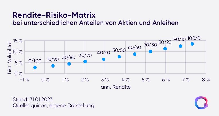
By the way: the 0/100 strategy, a pure bond portfolio, is included purely for information purposes. We want to let all our clients share in the return opportunities of the stock markets. That's why, in a wealth management mandate, the equity share in our global portfolio is at least 10 percent.
Even more portfolio details
The portfolio allocation overview breaks down how the money is distributed across various asset classes - in other words, what weight is given, for example, to stocks from developed markets and to low-risk bonds. On the equity side, our portfolios are also shaped by certain factors that play a special role. You'll find some information on these in the fact sheet as well, along with bond metrics - such as duration. "That tells you something about the average length of time capital is tied up in a portfolio," Kazankaya explains. The longer the maturity of bonds, the higher the return expectations tend to be, but also the risk. The current duration of our bond portfolio of a little more than three years reflects the role of this component, which is primarily to serve as a risk buffer.
The monthly fact sheet update lands automatically in your digital mailbox. But that's not the only reason it's worth glancing into your mailbox now and then. There you'll also find, for example, regular reports from the investment management team, in which you can learn more about the movements on the markets.